


| By: Paul S. Cilwa | Viewed: 7/26/2024 Posted: 6/7/2018 |
Page Views: 1167 | |
| Topics: #Computers #Programming #Organica #Flexbox #CSS | |||
| Building the very first Organica page. | |||

To get this project started, we're going to create, first, a web page (stored locally) to give us something to display. (Later, the "web page" will be generated programmatically; but this will keep things simpler for now.)
Organica is intended to display all data in a consistent manner, and to use HTML to display and CSS to format this data. That means that the data will be presented in a style similar to that employed by web pages, and manifested the same way. Although the data will be formatted via VB.NET code rather than physical page files, it will most convenient to start out with a page file so we can build the layout and see how it looks without having to first concern ourselves with the underlying, data-gathering code.
Remembering that the purpose of CSS (Cascading Style Sheets) is to separate the actual formatting instructions from the page that is to be formatted, it is to be expected that the page itself—as written in HTML (Hyper-Text Markup Language)—will be simple, with class names provided to tie the formatting styles to that which is to be formatted.
As a design rule, I decided to precede each specialized class name with "organica" to simulate a namespace.
Here's a graphic showing where we want each page component to appear. Note that not all components must appear on every page. But this shows the relative positions of the components when they do appear.
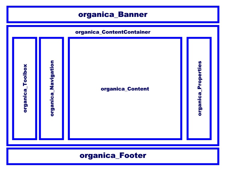
The major takeaway from this guide is that there is the outer section that flows from top-to-bottom, and the organica_ContentContainer, whose contents flow from left-to-right.
Prior to the introduction of CSS3, an arrangement like this was tricky to do, requiring deeply nested divs, layered absolute positioning, and worse. What's more, it was even trickier to make the page mobile-friendly. Fortunately, with the introduction of Flex boxes, such a layout becomes almost ridiculously simple.
Subdirectory Layout
We'll need a place to put this project. I created an Organica folder on my Desktop, with an Icon subdirectory; and, in the Icon subdirectory, a photo to use as a default user picture placeholder.
- \Organica
- \Icon
-

Sample_User.jpg
-
- \Icon
HTML
Now we're ready to create the HTML file for the demo page. You can use Notepad or any HTML editor. I'm calling the file "default.html" for no important reason; and it looks like this:
default.html
<!DOCTYPE html>
<html>
<head>
<meta content="text/html; charset=utf-8" http-equiv="Content-Type">
<title>Welcome to Organica</title>
<link href="Organica.css" rel="stylesheet" type="text/css">
</head>
<body>
<div id=organica_Banner>
<img src="Icons\Sample_User.jpg" id=organica_Icon>
<h1 id=organica_Nickname>Welcome to Organica</h1>
<h4 id=organica_Date>Current Date</h4>
</div>
<div id=organica_ContentContainer>
<div id=organica_Toolbox>Toolbox</div>
<div id=organica_Navigation>Navigation</div>
<div id=organica_Content>Content</div>
<div id=organica_Properties>Properties</div>
</div>
<div id=organica_Footer>
<h4>Organica</h4>
<h5>Copyright ©2018 Paul S Cilwa</h5>
<h6>All Rights Reserved</h6>
</div>
</body>
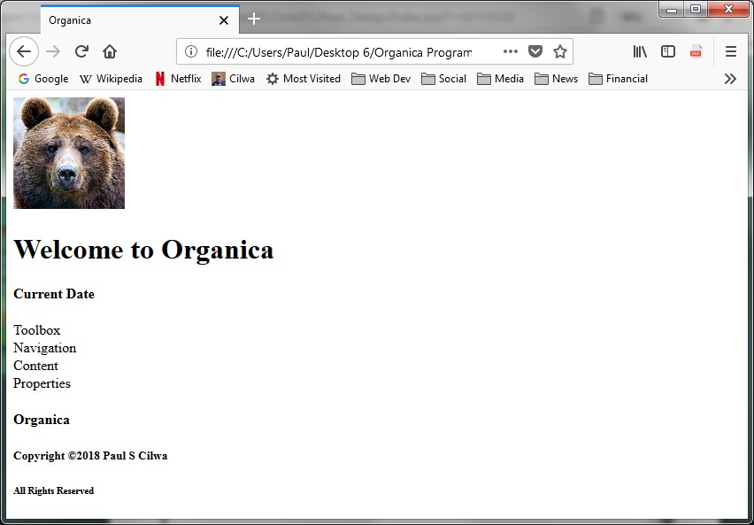
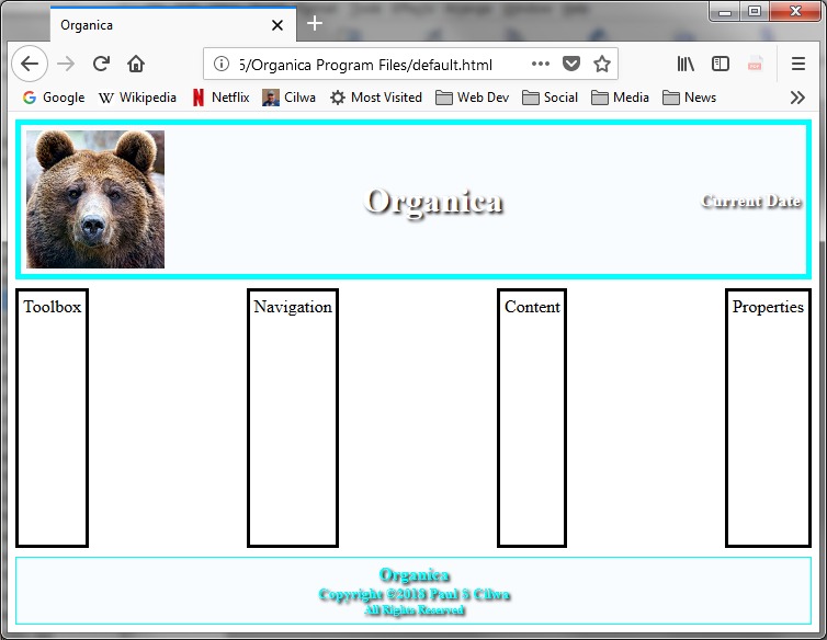
</html>If we look at this page in a browser before creating the CSS file (a missing CSS file does not cause an error in a browser), it will look like this, since none of the specified IDs is actually styled:
CSS
Now we're ready to start styling the page. We do so by creating the promised file, Organica.css, and populating it with skeleton ID styles.
Organica.css
/********************************************************************
N E U T R A L I Z E S B R O W S E R S
*********************************************************************/
*
{
margin: 0;
padding: 0;
border: 0;
box-sizing: border-box;
}
/********************************************************************
B A S I C C O N T A I N E R S
*********************************************************************/
body
{
}
@media only screen and (min-width: 1000px)
{
}
div#organica_Banner,
div#organica_Footer
{
}
div#organica_Banner
{
}
div#organica_Footer
{
}
div#organica_ContentContainer
{
}
div#organica_Toolbox,
div#organica_Navigation,
div#organica_Content,
div#organica_Properties
{
}
div#organica_Toolbox
{
}
div#organica_Navigation
{
}
div#organica_Content
{
}
div#organica_Properties
{
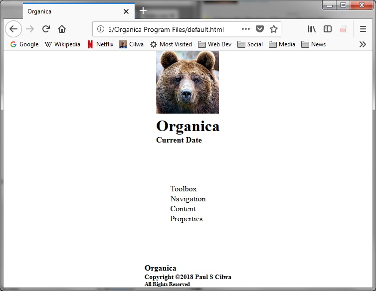
}So, remember we intend to make use of CSS3's new Flexbox technology. And the way it works, is you must have a Flexbox container, into which you can nest any HTML items—divs, headers, paragraphs, what-have-you—which will then be distributed across or down the Flexbox according to the Flexbox rules.
In other words, in order to create a top-level Flexbox, we can simply add a few styles to the body tag, which will give us an instantly-visible change, as the columnar layout shifts to spread the three top-level divs from top-to-bottom.
Although Flexboxes will "work" without any styles other than display: flex, the default is a horizontal layout, which is not what we want; so additional supporting styles are required.
Organica.css (expand)
body
{
display: flex;
flex-direction: column;
justify-content: space-between;
align-items: center;
flex-wrap: nowrap;
height: 100vh;
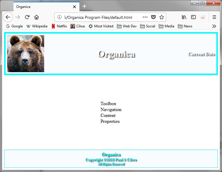
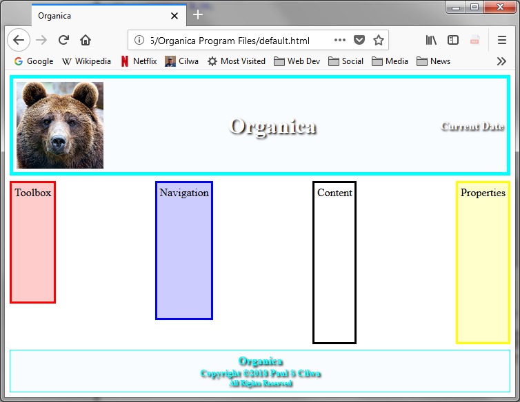
}Notice that while the divs are centered on the screen, the contents of the divs are not centered within the div. If that's an effect I want, I will have to style the actual item, just as I've always had to do.
For example, I can style the banner and footers to center the contents as well as make them stand out a little more.
Organica.css (expand)
div#organica_Banner,
div#organica_Footer
{
text-align: center;
width: 98%;
border: thick aqua solid;
margin-top: 1%;
margin-bottom: 1%;
background-color: rgba(240, 248, 255, 0.4);
color: white;
text-shadow: 2px 2px 2px black;
padding: 5px;
}
div#organica_Banner
{
display: flex;
justify-content: space-between;
align-items: center;
flex-wrap: nowrap;
}
div#organica_Footer
{
color: aqua;
border-width: thin;
}
The banner and footer classes describe perfectly ordinary divs, but the content container class is also supposed to be a Flexbox. This one is different from body, though, because it's supposed to distribute the contents horizontally rather than vertically.
This is, in fact, the default. But I prefer to specify defaults so there's never any question what my intention was.
Organica.css (expand)
div#organica_ContentContainer
{
display: flex;
flex-direction: row;
justify-content: space-between;
align-items: top;
flex-wrap: nowrap;
height: 100vh;
width: 98%;
}
div#organica_Toolbox,
div#organica_Navigation,
div#organica_Content,
div#organica_Properties
{
border-width: medium;
border-style: solid;
padding: 0.5%;
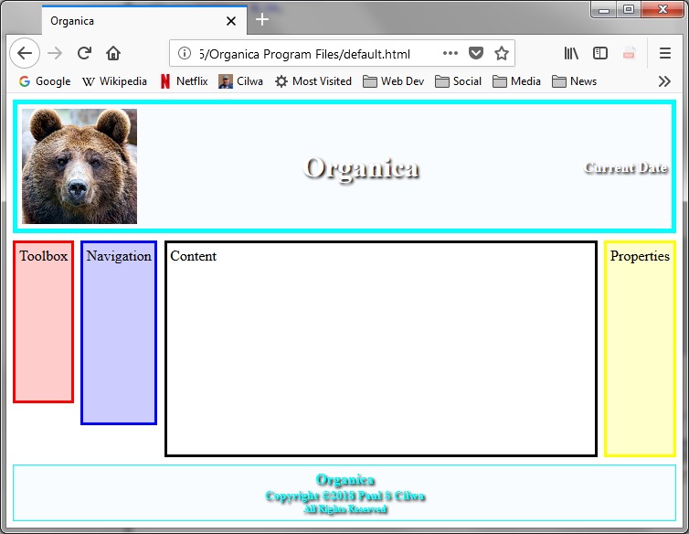
}I also added borders to the content container's component divs, just to make it easier to see what, exactly, is happening.
By specifying a height of 100vh, we make sure the content container takes up all the space between the banner and the footer. And the divs within the container are stretched out to fill the available height, unless I specify otherwise:
Organica.css (expand)
div#organica_Toolbox
{
margin-right: 1%;
border-color: red;
background-color: rgba(255, 0, 0, 0.2);
height: 75%;
}
div#organica_Navigation
{
margin-right: 1%;
border-color: blue;
background-color: rgba(0, 0, 255, 0.2);
height: 85%;
}
div#organica_Content
{
background-color: rgba(255, 255, 255, 0.4);
}
div#organica_Properties
{
margin-left: 1%;
border-color: yellow;
background-color: rgba(255, 255, 0, 0.2);
}So I've made each of the four content types distinct with different colors and an arbitrary vertical height, just to demonstrate the align-items: top style. (You can also choose to center or align items to the bottom, among other possibilities.)
Now, we clearly would prefer the Contents div to occupy all the space between the other components, which I expect will, in use, be pretty narrow. This is most easily accomplished via the flex-grow style, in which the designer specifies how much of the room in the Flexbox this div is allowed to take up. The value of this style is simply a number that is compared to any other flex-grow items in the container. (The default value is zero, if no others are specified.) This is one of the very few Flexbox styles that is applied to the contained item, rather than the Flexbox container, itself.
Organica.css (expand)
div#organica_Content
{
background-color: rgba(255, 255, 255, 0.4);
flex-grow: 8;
}
Final Touches
Before we leave the CSS styling completely, let's just add a pretty background photo to the body tag:
Organica.css (expand)
body
{
display: flex;
flex-direction: column;
justify-content: space-between;
align-items: center;
flex-wrap: nowrap;
height: 100vh;
background-color: forestgreen;
background-image: url('Organica.jpg');
background-repeat: no-repeat;
background-position: center;
background-attachment: fixed;
background-size: cover;
color: white;
}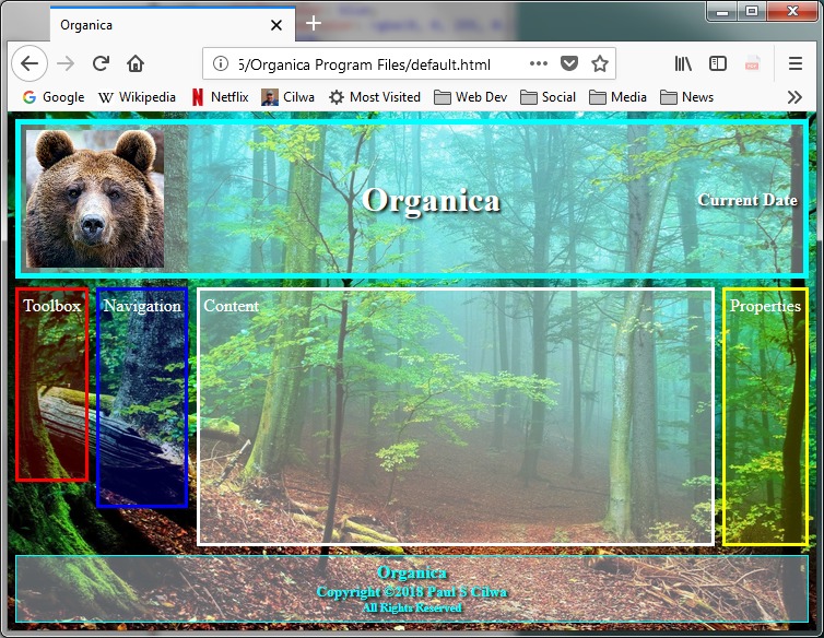
Now, be sure and try resizing the browser window, to see how the Flexbox keeps everything in order no matter the size or shape of the window in which it appears.
As a final touch, and this is purely cosmetic—I want to add some CSS to put a fine touch on the banner.
Organica.css (append)
/********************************************************************
B A N N E R
*********************************************************************/
img#organica_Icon
{
max-width: 100px;
}
div#organica_Banner h1
{
font-size: 32pt;
font-style: italic;
}